When 'just paint it white' is actually the right answer.
An honest case for the default — the three rooms where white is genuinely correct, the four undertones that hide inside the word white, and the one shade we keep coming back to after eleven repaintings.

The longest paint sale I have ever witnessed at my grandfather’s counter was a young couple from Center City in 2019, choosing white. They came in on a Saturday morning, sat at the chip rack with two large coffees and a baby in a stroller, and were still there at four in the afternoon. By the time they bought paint, they had narrowed an entire wall of paint chips down to three shades that, to my eye, were indistinguishable. They picked one. They came back two weeks later for a second gallon and a re-tint. The first white had been wrong; the second was the one. They were not, as it turns out, foolish people. They were paying attention.
Almost every first-time homeowner who has ever asked us what color to paint a room has, somewhere in the conversation, received the advice just paint it white. The advice is given with affection. It is received, in our experience, with quiet resentment. The reader who has decided to renovate the dining room did not picture themselves painting the dining room white; they pictured themselves choosing a color. This piece is a partial defense of the advice — the three rooms in which it is, in fact, correct — and a more careful argument about which white you are actually being told to use.
Because the honest answer to which white is not white. The honest answer is one of four undertones, and choosing the right one is the difference between a room that looks intentional and a room that looks like a rental.
The case for white — and the honest case against.
The case for white walls, when made well, is four things at once. White maximizes reflected light in a way no other color does, which is genuinely useful in small rooms, in north-facing rooms, and in rooms with one small window. White never goes out of style, which matters because you will repaint the same wall four to six times in your years in a house and the colored choices age faster than the white ones. White trim coordinates with white walls without thought, which removes the second-hardest paint decision from the project. And white is the cheapest color to undo, because the next coat of any color goes on cleanly over white in two coats. It is the safest paint decision a first-time homeowner can make, and safety is sometimes the right call.
The case against, when made honestly: white can feel generic. It can read as I did not have an opinion about this room, especially in rooms that have personality of their own — a leaded-glass window, a chair-rail, a fireplace. White does not give a room a mood; it lets the rest of the room speak. If the rest of the room has nothing to say, a white wall can feel like a missed opportunity.
The honest middle, after twenty years at a paint counter: pick the right white deliberately, and the room stops looking like a default. Pick the wrong white, or pick any white without paying attention, and the room confirms every resentment people have ever had about the advice.
The three rooms where white is genuinely correct.
The small bathroom.
A bathroom under fifty square feet, with one window or none, lives or dies on reflected light. White walls bounce the light from the vanity bulb back into the room two and three times before it dies — a colored wall absorbs the same light on the first pass. The functional difference, in a five-by-eight bath, is the difference between a room that feels closed-in and a room that feels like a small calm box. (A trade-off worth naming: white walls in a bath show every speck of toothpaste. A satin sheen — see our paint-label guide — solves it.)
The north-facing room.
A north-facing room, in the Northern Hemisphere, never sees direct sunlight. The ambient daylight in such a room is cooler than the ambient daylight in a south-facing room, by enough that a colored wall in a north-facing room will read at least one half-step cooler than the same color in a south-facing room. The fix, traditionally, is a warm wall color to compensate. The other fix, which more first-time homeowners reach for than they admit, is a warm white — a white with a soft yellow undertone — which gives the room the warm cast it is missing without committing to a colored wall.
The room with carpentry.
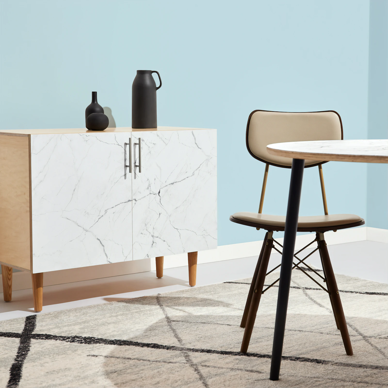
Period rooms — older houses with original moldings, chair rails, picture rails, painted built-ins, paneled doors — have, already on the wall, more visual interest than any wall color is going to add. The wall in such a room is a frame for the carpentry. Painting it white lets the moldings and the trim — and the shadow lines they throw — do the design work the wall does not need to do. Many of the most striking interior rooms in the houses we have helped first-timers paint are white-on-white, three sheens, no other color anywhere — and they read as the most intentional rooms in the houses.
The four whites that aren’t white.
What the chip rack calls white is, in almost every case, a near-white with a subtle undertone. There are four undertones to know, and a chip card held flat on a counter will tell you which one you are looking at — every white, held alone, reads pure; held against the three others, the undertone declares itself immediately. The four families are warm (yellow/cream), cool (blue/grey), near-true (almost no undertone), and pink-rose (the trap — flatters faces in lighting stores, reads as I painted my wall pink by accident at home).
The three cards below are the workhorses we reach for first, by undertone. Each one is genuinely usable across most of a first-time homeowner’s house; the differences are subtler than they look on a screen and real on a wall.
BM OC-117
A whisper of yellow. Forgiving in warm light.
Best for: south-facing · period rooms · soft light
The reliable warm white that has been quietly painted on more living rooms in the last decade than any other Benjamin Moore color. Reads almost-white in most light, edges toward a soft cream at golden hour, and never tips into yellow even when paired with cool-toned trim. Forgives a not-quite-flat ceiling, makes south-facing rooms feel touched-by-sun without ever becoming actually yellow. The first pick when you do not know which white you want.
- Where it belongs Living, dining, bedrooms
- Undertone Soft yellow / cream
- LRV (light reflectance) 91
- Pair with trim Same color, higher sheen
- Pair with woods Warm oak, walnut, cherry
- Price · gallon $58 (Regal Select)
SW 7005
Neutral, slight blue. Crisp in cool light.
Best for: north-facing · modern rooms · cool light
Sherwin-Williams' workhorse cool-leaning white, and the default the magazine photographers reach for. Sits clean against stainless and white-oak floors; calms the warm cast of incandescent bulbs without going icy. The right pick for north-facing rooms whose afternoon light tips warm anyway, and for modern interiors whose other surfaces (steel, glass, polished concrete) want a wall color that does not fight them.
- Where it belongs North-facing · modern rooms
- Undertone Neutral, slight cool
- LRV (light reflectance) 84
- Pair with trim Same color, semi-gloss
- Pair with woods White oak, ash, light pine
- Price · gallon $62 (Emerald)
BM OC-65
The whitest white most people can live in.
Best for: small baths · galleries · trim
The closest mass-market white to actual white — clean, bright, almost no undertone at all. Lives well on small bathroom walls (the maximizes-light effect is real), in any space hung with art (the wall disappears, the art speaks), and as the trim color paired with almost any wall in the brand's near-white range. The trap is rooms where it lives alone, in cool light, with no warm wood — it can tip cold quickly.
- Where it belongs Small baths · gallery walls · trim
- Undertone Almost none
- LRV (light reflectance) 92
- Pair with trim Itself, higher sheen
- Pair with woods Cooler woods, painted floors
- Price · gallon $58 (Regal Select)
The pink-rose family — Behr Swiss Coffee in the wrong light, certain off-the-shelf “soft white” lines that go heavy on pink colorant — is the one we steer first-timers away from. The reason is not that pink-undertone whites are wrong; it is that they are wrong in nine rooms out of ten, and the tenth room (a south-facing morning kitchen, with warm-toned wood) is hard to predict from a chip in a hardware store. Skip it.
The shade we keep coming back to.
If we were forced to pick one white to paint half the houses we have helped first-timers paint — and we sometimes are, when a couple is decision-fatigued at a chip rack on a Saturday afternoon and needs a starting point — it is Benjamin Moore Simply White, OC-117. The reasons are practical, not poetic. Its undertone is soft warm without ever tipping into yellow; it sits gracefully against the warm woods that most US houses contain; it reads almost-white in any light condition we have ever tested it in; and it is the closest thing to a default that twenty years at a paint counter has produced.
The runners-up, in case the local store does not carry Benjamin Moore: Sherwin-Williams Alabaster (SW 7008) is a very close match, perhaps a half-step warmer. Behr Polar Bear (75) sits closer to a true-white than to a warm; it is the right pick if Simply White is reading too warm in a specific room.
None of these are decisions to make on a screen. The chip on the rack lies; the can lies even more (the lid is glossier than the wall will be). The only honest version of the decision is the next section.
How to test a white in your own light.
The single most important Sunday-afternoon investment in a paint decision is the test patch. Five dollars in sample paint, painted on the wall it will live on, viewed in four light conditions over forty-eight hours. The chip on the rack will mislead you; the can will mislead you a little less; the wall will tell you exactly what the paint is going to do. The cost of the test patch is the cost of one returned gallon of paint, which is the cost of being wrong without the test patch.
The 2-by-2 sample.
Buy a sample-size jar (most paint stores sell them for $5–8). Roll a 2-by-2-foot square on the wall, two coats, exactly where it will live. Tape a sheet of plain white printer paper next to it for reference — that is what true white looks like; the test patch is whichever undertone away from that the can has produced. If you are torn between two whites, paint both, side by side, with a finger-width gap of unprimed wall between them. One small caveat: if the wall has any drywall patches, prime those first per our drywall-patching guide — the patch will absorb test paint at a different rate than the surrounding wall and skew the read.
The four light conditions.
Look at the patch four times: at morning (cool light through the window, before nine), at noon (the brightest overhead light, around twelve-thirty), at late afternoon (the warm raking light from low sun, around five), and at evening (room lights on, no daylight, around nine). A white that looks right at noon and wrong at evening is going to look wrong at evening for the rest of its life on the wall. All four light conditions are part of the test.
The 48-hour rule.
Look at the patch for two days, not two hours. A first impression is unreliable. The brain adjusts to a new color in minutes; the brain adjusts to a new color in context, with the rest of the room around it and a meal cooked next to it and a guest sitting in the chair across from it, in days. The shade that still looks right on Sunday evening is the right shade.
Just paint it white is honest advice, in three rooms, with one of four undertones, after one weekend of test patches. Anything less than that is, in fairness, what the resentment is about.