The Workshop Journal, a field manual.
The locked design system for The Home Renovation Blog. Every color, every type size, every reveal. When in doubt, refer here. When making something new, follow this.
Calm confidence. Warm authority.
- · A trusted teacher
- · A steady guide
- · An editorial publication
- · The publication-of-record for new homeowners
- · Authority that reads as warmth, not credentials
- · Corporate / Home-Depot-y
- · Bro-y / power-tool-macho
- · Precious / overly designed
- · Chaotic blog-template
- · Marketing-tone optimized for SEO above readers
Twelve tokens. Pick from these.
Every color on the site comes from theme.css.
Use Tailwind brand utilities (bg-brand-primary, text-brand-muted).
Opacity modifiers work (/10, /60).
CTAs, italic emphasis, drop caps
Hover / pressed states
Inverted sections, brand mark
Atmospheric blends in dark sections
Layered depth in dark sections
Editorial highlight only — sparingly
Page background — paper, not flat color
Card surfaces, subtle washes
Primary body text
Display headings where book depth matters
Captions, dates, eyebrow labels
Borders, dividers — never thicker than 1px
Cream is paper, not an empty page. Always layer warm radial gradients and a subtle SVG fractal-noise grain over the cream so it reads as printed paper, not a flat color.
Fraunces does the singing. Inter does the speaking.
Push the variable axes.
Fraunces is a variable font with three axes worth using deliberately:
- opsz 9–144 — chunkier at small sizes, refined at display sizes
- wght 100–900 — light italics for display, heavier roman for headings
- SOFT 0–100 — higher = warmer, more humanist letterforms
One word in italic + terracotta. Use sparingly — at most three sections per page. Reserved for: the Hero opening, one mid-page editorial moment, one closing sentiment. Other sections use small caps, hand-drawn underlines, or no flourish.
Asymmetric grids. Generous whitespace.
Asymmetric two-column. Hero, featured-article spreads.
Editorial ToC pattern. TopicCategories on the homepage.
One element per section bleeds past the column. Image bleeds, pull quotes outdent, decorative rulers escape.
Soft corners. Warm shadows.
Default card lift
Hover lift, featured elements
Floating moments — handwritten letters
The carpenter's rule.
One repeating motif gives a publication its visual signature. Ours is a small carpenter's-rule SVG. It earns the brand its workshop journal identity.
Frequency budget: ~12 instances per page. Use in section eyebrows, the featured Hero moment, and one floating decorative element. Don't decorate with it — let the eye rest.
- · Section eyebrows (one per section, always)
- · The featured moment in the Hero
- · One floating decorative bleed in EditorialPrinciples
- · Inside repeating items (cards, list rows)
- · As a hover affordance on link-size text
- · More than ~12 instances per page
Real photographs. Always treated.
Real Unsplash photos, never illustrated SVG kitchens. Two overlays — a cream multiply and an SVG grain — warm every photo to match the page.
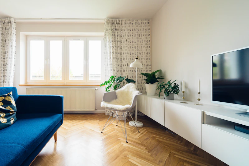
Unsplash hotlinks with ?auto=format&fit=crop&w=XXX&q=80. Pick widths that match the layout.
Lived-in, not staged. A real-feeling kitchen with one mug on the counter beats a magazine showroom.
Warm — cream, wood, terracotta, soft sage. Avoid cool blues and greys that fight the cream.
Smooth ease-out. No bounce.
One easing curve everywhere: cubic-bezier(.2, .7, .2, 1). The brand is calm; bouncy springs fight the voice.
Click Replay on each demo to re-trigger the animation.
Sentence case. Talk to the reader.
Things we've tried and rejected.
Each of these once seemed like a good idea. Each was overruled by the brand voice. Don't reinvent them.
- 01 Icon-tile card grids (4×2 of identical title+blurb tiles)
- 02 Avatar-circle testimonials with big quote-mark glyphs
- 03 Animated stat counters (fights the calm voice)
- 04 SVG-illustrated abstract scenes as primary imagery
- 05 Purple gradients on white (this is a cream + warm-earth brand)
- 06 Bouncy spring animations (smooth ease-out only)
- 07 Flat cards on flat backgrounds
- 08 More than 3 italic-terracotta-accent flourishes per page
- 09 More than ~12 RulerMark instances per page
- 10 Lucide-style stroke icons as primary visual elements
- 11 Title Case in headings (use sentence case)
- 12 "Design by gut" type sizes — use the ladder
Twelve steps before you ship.
Run through this every time you build a new page (topic hub, individual article, 404, anything). It's faster to read this list than to undo a drift.
- 01Read this guide before starting
- 02Wrap in <Layout> from src/layouts/
- 03Reuse Nav, Footer, Newsletter, RulerMark from src/components/site/
- 04Brand utility classes only — no <style is:global> on :root
- 05Pick from the type scale ladder
- 06Asymmetric grids — no 50/50, no centered cards
- 07Real Unsplash photography with cream-multiply + grain treatment
- 08One italic-terracotta-accent flourish max per new section
- 09Section eyebrow uses .wj-reveal-mask
- 10Smooth ease-out only — no bounce springs
- 11Test mobile at 375px
- 12Run dev server and look at the page before declaring done
— The Editors